
Stories inspire, engage, and have the unique ability to transform statistical information into a compelling narrative that can significantly enhance business success.
By gaining centralized access to business data and presenting it in a visual way that follows a logical path and provides invaluable insights on a particular area or subject, you stand to set yourself apart from your competitors and become a leader in your field.
Here, we’ll explore the unrivaled power of data storytelling in the digital age while looking at a mix of powerful data storytelling examples generated with a modern dashboard creator.
What Is Data Storytelling?
Storytelling through data is the process of transforming data-driven analyses into a widely-accessible visual format to influence a business decision, strategy, or action by utilizing analytical information that, ultimately, turn into actionable insights.
Beyond this data storytelling definition, the power of a data story lies in our natural affinity for plotlines and narratives that convey information. By leveraging the right tools, it’s possible to take quantitative metrics or information, arrange it into a logical format, and create a narrative that simplifies complex information, presenting it in a way that engages a particular target audience.
Data storytelling has a host of business-boosting benefits.
The Benefits Of Data Storytelling
Tales help make sense of the world around us, and this very notion is the beating heart of using data to tell a story.
According to a study performed by Skyword, content that features a mix of words and visuals drives 34% more engagement than text-only articles, blog posts, or whitepapers. You have everything to gain by harnessing the power of data visualization, visual analytics and using a mix of relevant insights to create a compelling narrative.
Here are the key benefits of knowing how to tell stories with data:
- Inclusion: As mentioned, at a fundamental level, stories help us make sense of a complex and occasionally bewildering world. By using the right data storytelling tools to measure, track, and extract relevant data and place it into a visual format that fits into a narrative based on specific business goals, you will make your analytical information accessible to a wider audience. By doing so, you’ll be able to share important messages in a way that inspires, encouraging buy-in from the right parties or stakeholders as a result.
- Decision: By telling a data story through a powerful KPI dashboard software, you’ll be able to drive improved decision-making throughout the organization in several critical areas of the business. If your audience, whether internal or external to the organization, can follow a narrative and extract the right information from your presentation, they’ll gain the insight they need to base their strategies on water-tight data, making the organization more efficient, economical, and successful as a whole.
- Organization: In a world dominated by data, knowing which insights to explore can prove daunting. But by working with the right data storytelling tools, not only is it possible to simplify the analytics process, but you’ll also gain the ability to arrange your data in a way that’s effective, efficient, and ultimately saves you time. As you’re no doubt aware—in business, time is money.
- Action: If you tell stories with data and tailor your presentations to your target audience, you’ll drive actionable results. If the person is inspired by what you have to show them, and they understand it on a deep, meaningful level, they will act in the desired way. For instance, if your audience is internal, they may formulate an initiative that helps enhance the company’s marketing efforts. Or, if you’re presenting to external stakeholders through storytelling with data, you might prompt them to increase their investment.
“Storytelling is the essential human activity. The harder the situation, the more essential it is.” – Tim O’Brien, author
How To Tell Stories With Your Data?
It’s clear that storytelling with data is powerful. To place the notion of knowing how to tell stories with data into practical perspective, here we look at a mix of data storytelling examples or concepts, backed with actionable advice as well as genuine data storytelling templates.
a) Turn metrics into actionable concepts
As we’ve explored, knowing how to tell a story with data will empower you to turn metrics into actionable concepts or insights.
One of the most effective ways of transforming quantitative data into a results-driven narrative is by working with key performance indicators (KPIs).
By harnessing the power of an interactive business intelligence (BI) dashboard, you’ll be able to select the KPIs that align with your core business goals, using the perfect mix of graphs, charts, and visuals to build a narrative that brings your data to life.
To get under the skin of this most priceless concept, read our guide to data-driven dashboard presentation.
b) Improve processes with plotting
Every solid story, regardless of its theme or format, has a definitive plot: a beginning, a middle, and an end.
By using data storytelling templates, tools, and platforms, you can populate your plot with the visualizations that will drive the narrative forward while conveying your message in the most effective way possible.
To improve your processes with plotting, you should sit down in a collaborative environment and consider the primary aim of your data-driven story while outlining the beginning, middle, and end.
With your framework firmly in place, you should start to populate your plot with the KPIs and visualizations that not only represent what you have to say but are also most relevant to the data you’re looking to present.
By working through your plot logically and fleshing it out with the right visualizations from your dashboard, you’ll help streamline processes within your organization, increasing efficiency and productivity as a result.
c) Simplify & make connections
If your business is informed, well-oiled, and strategic across the board, you will grow, evolve, and boost your profits over time.
By harnessing the power of storytelling through data, you’ll be able to connect the dots, simplifying ideas and making the kind of connections that will give your business a newfound sense of strategic direction.
To squeeze the maximum benefit from your data storytelling efforts, you should focus on creating an interactive dialogue between your insights and your audience, using a mix of historical, real-time, and predictive data to drive your message home, whether for financial reporting processes or strategic development of the company.
Moreover, you should create a balance or harmony between your words and your visuals to make it easier for your audience to make the necessary connections that will result in business-enhancing actions.
The most powerful way of creative data-driven narratives that simplify insights is to take a “storytelling with data visualization” approach to your efforts. Now, we’re going to explore this invaluable concept in action.
Tell Stories Through Data Visualization
Storytelling with data through data visualization is the best way to share stories with your audience. It’s the glue that binds all of the ideas we’ve mentioned so far.
To demonstrate the power of storytelling with data visualization, here are two strikingly different but equally powerful visuals used for building an effective narrative with your insights.
Employee Performance Dashboard Example
Featured KPIs:
- Absenteeism Rate
- Overtime Hours
- Training Costs
- Employee Productivity
Primarily used to streamline busy human resources departments, this HR dashboard that focuses on employee performance features a mix of KPIs that build a comprehensive profile around attendance rates, individual productivity, training costs, and overtime hours accrued.

**click to enlarge**
It’s possible to use this dynamic mix of charts, graphs, and graphical information by utilizing HR analytics tools, and build an effective narrative relating to employee performance over a particular time frame, creating a compelling plot that will lead to increased productivity and enhanced economic efficiency as well as and support strategies that will boost staff engagement exponentially.
By looking at this dashboard and related HR KPIs, it’s easy to see how you could build a plot around this perfect storm of insights. Coupled with the data visualizations featured in related HR-based dashboards, the possibilities are seemingly endless; from creating effective HR reports to obtaining a birds-eye view of the whole human resources processes and development.
Compliance Rate KPI
A valued fulfillment-based KPI across industries, this dynamic mix of graphs offers a panoramic snapshot of supplier compliance rates over a particular time frame.
A key component of our procurement dashboard, the compliance rate KPI is a prime example of how powerful an individual visualization can be in communicating vital information and how it can fit into a broader narrative.
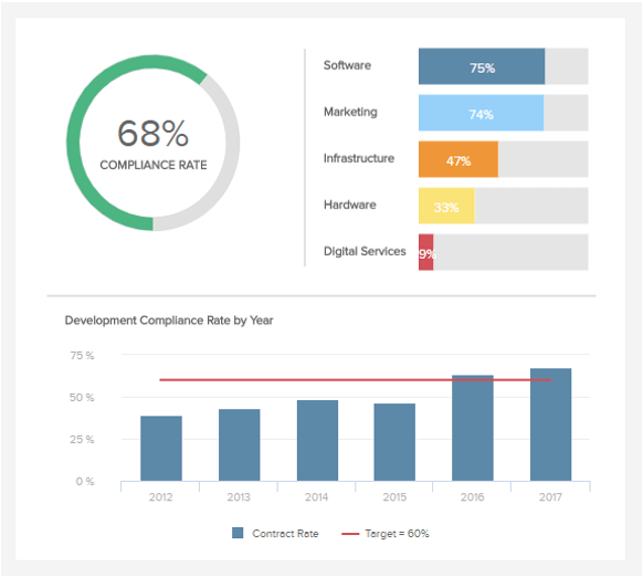
It’s possible to place this KPI into the heart of a story surrounding procurement structures, success, and processes, offering a breakdown of compliance per supplier in addition to the company’s overall compliance success rate.
Connected with a tailored mix of our additional top 10 procurement KPIs, it’s possible to develop a story that helps to convey key trends, connect organizational dots, and share actionable insights that drive real change. A prime business report example of big data storytelling in action.